SPSS software, a statistical powerhouse, is your go-to tool for crunching numbers and making sense of data. Whether you’re a psychology major wrestling with survey results, a business student analyzing market trends, or a researcher diving deep into complex datasets, SPSS offers a user-friendly interface and powerful statistical capabilities to help you unlock the hidden stories within your data.
From basic descriptive statistics to advanced techniques like regression analysis and factor analysis, SPSS provides a comprehensive toolkit for all your data analysis needs. It’s the workhorse of many research projects, and learning its ins and outs is a major plus for anyone hoping to delve into the world of quantitative analysis.
This guide will walk you through the essential features of SPSS, from importing and cleaning your data to running sophisticated statistical tests and creating compelling visualizations. We’ll cover everything from the basics of descriptive statistics to more advanced techniques, making sure you’re comfortable using SPSS to tackle your own research projects. We’ll even throw in some tips and tricks to make your analysis smoother and more efficient.
SPSS Software Overview
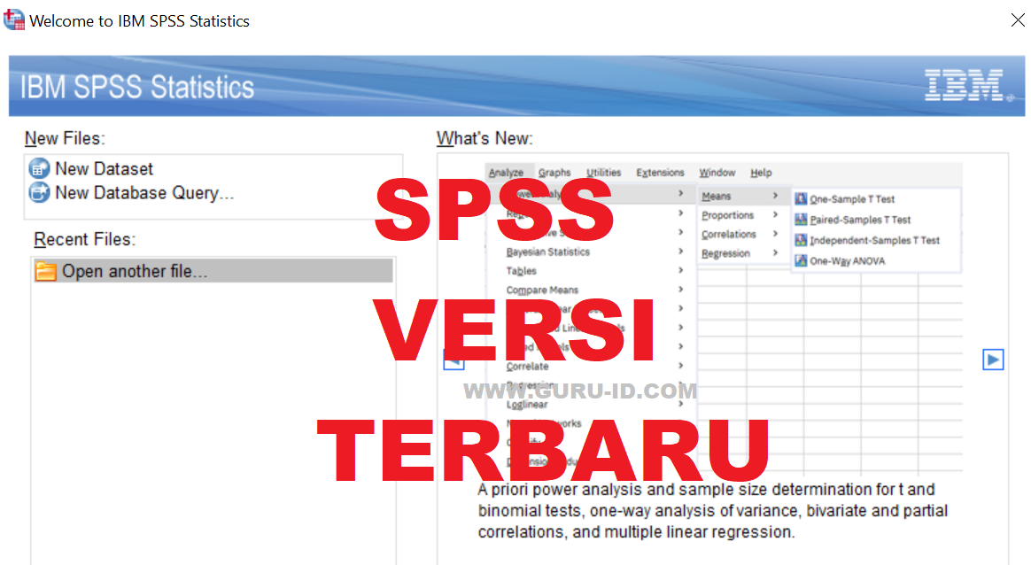
SPSS, or Statistical Package for the Social Sciences, is a powerful statistical software package used for analyzing data. It’s incredibly versatile, offering a wide range of tools for everything from basic descriptive statistics to complex multivariate analyses. Its user-friendly interface makes it accessible to researchers across various disciplines, even those without extensive programming experience.SPSS is primarily used for managing and analyzing data, generating reports, and creating visualizations to help researchers draw meaningful conclusions from their datasets.
Its capabilities extend far beyond simple calculations; it enables sophisticated statistical modeling and testing, facilitating in-depth research and data-driven decision-making.
SPSS Versions and Key Features
Different versions of SPSS exist, each offering a unique set of features catering to specific needs and user expertise levels. Generally, the higher the version number, the more advanced the functionalities and the greater the computational power. While specific features vary across versions, common capabilities include data management, statistical analysis (descriptive, inferential, and predictive), data visualization, and report generation.
For example, newer versions often incorporate advanced machine learning algorithms and improved graphical interfaces. Older versions, while lacking some of the newer features, might still be suitable for specific research needs or for users who are comfortable with their functionality. The choice of version often depends on the complexity of the analysis, the budget, and the user’s familiarity with the software.
Target User Base for SPSS
SPSS caters to a broad range of users across diverse fields. Researchers in academia, particularly in social sciences, business, and healthcare, heavily rely on SPSS for their statistical analyses. Market research analysts utilize its capabilities to interpret consumer behavior and preferences. Government agencies use it for analyzing census data and evaluating social programs. Businesses employ SPSS for market analysis, customer segmentation, and predictive modeling.
Essentially, anyone working with quantitative data and needing robust statistical tools finds SPSS valuable. The software’s accessibility, coupled with its extensive capabilities, makes it a go-to tool for both novice and expert statisticians.
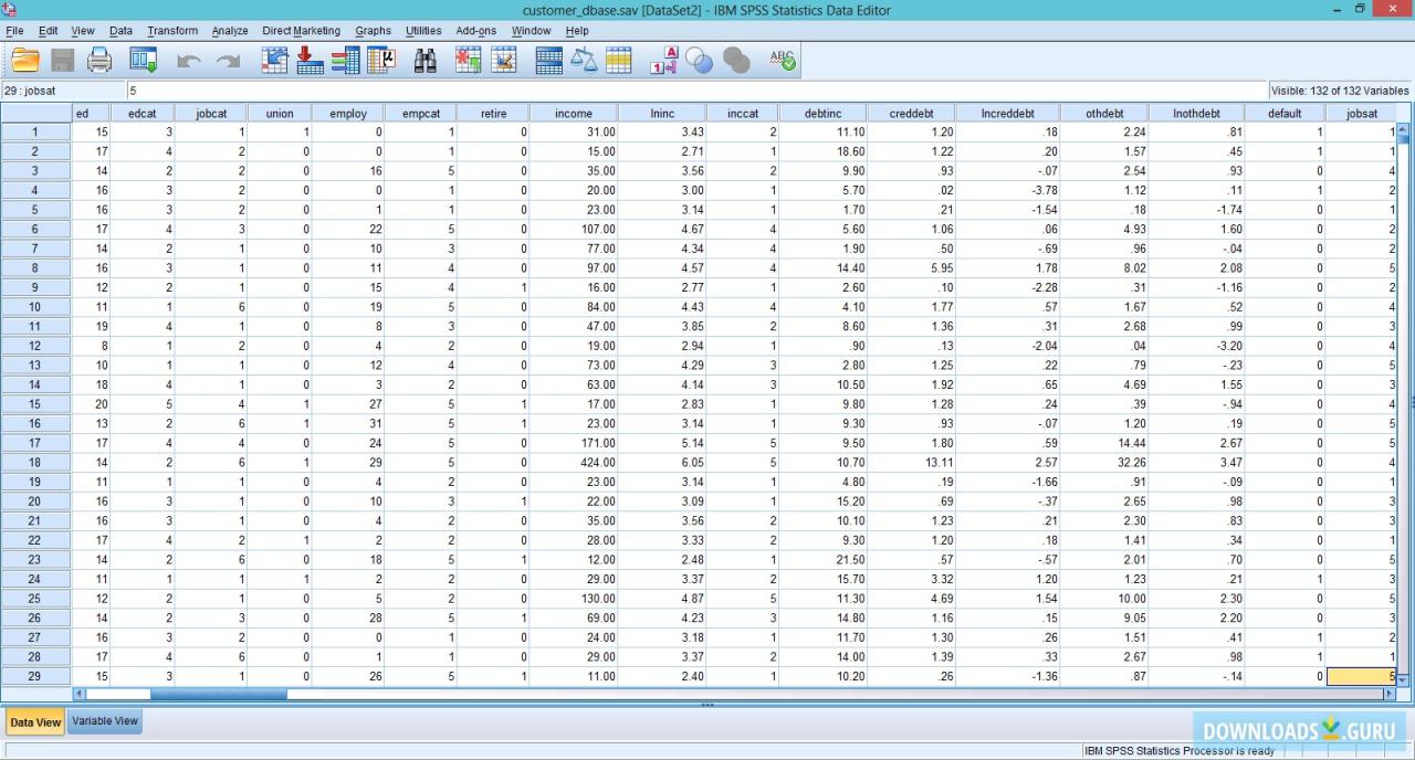
Data Input and Management in SPSS: Spss Software
Okay, so you’ve got SPSS open and ready to go. Now what? The next big step is getting your data into the program and making sure it’s clean and organized. This part might seem tedious, but trust me, good data management saves you headaches later on. Think of it as laying a solid foundation for your analysis – a wobbly foundation means a wobbly analysis!Getting your data into SPSS is pretty straightforward.
There are several ways to do it, each with its own pros and cons depending on your data source.
Okay, so SPSS is killer for crunching data, right? But what if you need to analyze the financial implications of your research findings? That’s where knowing something like xero accounting comes in handy. Understanding how to interpret financial data, alongside your SPSS analysis, makes your research way more robust and impactful. Basically, SPSS gives you the stats, and Xero helps you understand the business context of those stats.
Data Import Methods
SPSS offers multiple avenues for importing data. The most common methods include importing data from spreadsheet programs like Excel or Google Sheets, directly from text files (like .csv or .txt), and from databases. You can also import data from other statistical software packages. Choosing the right method depends on the format your data is already in. For example, if you have a neatly organized Excel spreadsheet, that’s your easiest route.
If your data’s in a database, you’ll need to use the database connection features in SPSS.
Data Cleaning and Management
Once your data is in SPSS, the real work begins – cleaning it up. This involves identifying and correcting errors, inconsistencies, and missing values. Imagine you’re a meticulous editor reviewing a manuscript; you need to ensure everything is accurate and consistent. In SPSS, this might involve checking for outliers (extreme values that might skew your results), handling missing data (deciding whether to remove those cases or impute values), and ensuring your variables are coded correctly.
SPSS offers tools to help you with all of this, including frequency tables to examine variable distributions, and various methods for handling missing data (like mean substitution or more sophisticated imputation techniques).
Variable Creation and Modification
Creating and modifying variables is a crucial part of data management. You might need to create new variables based on existing ones (for example, calculating a ratio or creating a categorical variable from a continuous one). Modifying existing variables might involve recoding values (changing how a variable is categorized), changing variable labels for clarity, or transforming data (e.g., standardizing scores).
These actions are performed using the “Transform” menu within SPSS, providing flexibility to tailor your dataset to your specific analysis needs. For instance, you might recode a variable representing age ranges into numerical values for statistical modeling. Or, you might create a new variable representing the interaction between two existing variables to test for potential combined effects. These are common steps in preparing data for analysis.
Descriptive Statistics with SPSS
Descriptive statistics are your bread and butter when it comes to understanding your data. Before you dive into complex analyses, you need to get a feel for what your data looks like – its central tendency, spread, and overall distribution. SPSS makes this process incredibly straightforward. This section will cover how to use SPSS to generate key descriptive statistics, helping you to effectively summarize and visualize your data.
Generating Frequency Tables
Frequency tables are a simple yet powerful tool for understanding the distribution of categorical variables. They show how many times each category appears in your dataset. In SPSS, you can generate a frequency table by going to Analyze > Descriptive Statistics > Frequencies. Select the variable(s) you’re interested in and click OK. The output will display a table showing each category and its corresponding frequency, percentage, and cumulative percentage.
For example, if you were analyzing survey responses about favorite colors, the frequency table would show the count of people who chose red, blue, green, and so on. This helps you quickly see which colors are most and least popular.
Creating Histograms
Histograms are visual representations of the distribution of a continuous variable. They show the frequency of data points within specified ranges (bins). To create a histogram in SPSS, you’ll again go to Analyze > Descriptive Statistics > Frequencies. Select your continuous variable and then click on the Charts button. Choose “Histograms” and click Continue, then OK.
The resulting histogram will visually display the distribution of your data, allowing you to identify patterns such as skewness or multimodality. For instance, if you were analyzing exam scores, a histogram would visually show the distribution of scores, revealing if the scores are clustered around the mean, skewed towards higher or lower values, or have multiple peaks.
Generating Summary Statistics
Summary statistics provide numerical summaries of your data’s central tendency and variability. These include measures like mean, median, mode, standard deviation, and variance. In SPSS, you can obtain these statistics by going to Analyze > Descriptive Statistics > Descriptives. Select your variable(s) and click OK. The output will provide a table containing these key descriptive statistics.
For example, if you’re analyzing income levels, the summary statistics would show the average income (mean), the middle income value (median), the most frequent income (mode), and how spread out the income values are (standard deviation).
Comparison of Descriptive Statistics
| Statistic | Description | Use Cases | SPSS Function |
|---|---|---|---|
| Mean | Average value | Summarizing central tendency for normally distributed data | Analyze > Descriptive Statistics > Descriptives |
| Median | Middle value | Summarizing central tendency for skewed data, less sensitive to outliers | Analyze > Descriptive Statistics > Descriptives |
| Mode | Most frequent value | Identifying the most common category or value | Analyze > Descriptive Statistics > Frequencies |
| Standard Deviation | Measure of data spread around the mean | Assessing data variability | Analyze > Descriptive Statistics > Descriptives |
| Variance | Square of the standard deviation | Assessing data variability, used in statistical tests | Analyze > Descriptive Statistics > Descriptives |
Inferential Statistics in SPSS
Inferential statistics moves beyond simply describing your data; it allows you to make inferences about a larger population based on a sample. In SPSS, this involves using various statistical tests to determine if observed patterns are likely due to chance or represent a real effect. We’ll explore some of the most common inferential tests and how to interpret their results.
T-tests
T-tests are used to compare the means of two groups. A one-sample t-test compares a sample mean to a known population mean, while an independent samples t-test compares the means of two independent groups, and a paired-samples t-test compares the means of two related groups (e.g., before and after measurements on the same individuals). The core of the t-test lies in determining whether the difference between the means is statistically significant, meaning it’s unlikely to have occurred by random chance.
SPSS provides clear output including the t-statistic, degrees of freedom, and the p-value. A p-value less than your chosen significance level (typically 0.05) indicates a statistically significant difference between the means. For example, we might use an independent samples t-test to compare the average test scores of students who received a new teaching method versus those who received the traditional method.
Assumptions of T-tests, Spss software
Several assumptions underlie the validity of t-tests. Data should be approximately normally distributed, especially for smaller sample sizes. For independent samples t-tests, the variances of the two groups should be roughly equal (homogeneity of variances). Violations of these assumptions can be addressed through transformations or the use of non-parametric alternatives like the Mann-Whitney U test. SPSS provides tools to check for normality (e.g., histograms, Q-Q plots) and equality of variances (Levene’s test).
Interpreting T-test Results
SPSS output for a t-test typically includes the t-statistic, degrees of freedom (df), and the p-value. The t-statistic measures the difference between the means relative to the variability within the groups. The p-value indicates the probability of observing the obtained results (or more extreme results) if there were no real difference between the groups. A small p-value (e.g., p < .05) suggests that the observed difference is statistically significant, meaning it is unlikely to have occurred by chance. The output also includes confidence intervals, providing a range of plausible values for the true difference between the means in the population.
ANOVA (Analysis of Variance)
ANOVA extends the t-test to compare the means of three or more groups.
A one-way ANOVA compares means across one independent variable (factor), while more complex ANOVAs (e.g., two-way ANOVA) can handle multiple independent variables. Similar to t-tests, ANOVA uses F-statistics and p-values to determine whether there are statistically significant differences between group means. For instance, we could use a one-way ANOVA to compare the average plant growth under different fertilizer treatments (e.g., fertilizer A, B, C).
Assumptions of ANOVA
ANOVA also relies on several assumptions. The data within each group should be approximately normally distributed, and the variances of the groups should be roughly equal (homogeneity of variances). Independence of observations is also crucial, meaning that the observations within each group are not related to each other. Violations of these assumptions can be addressed using transformations or non-parametric alternatives like the Kruskal-Wallis test.
Interpreting ANOVA Results
SPSS output for ANOVA includes the F-statistic, degrees of freedom, and the p-value. The F-statistic reflects the ratio of variance between groups to variance within groups. A significant p-value (typically p < .05) indicates that there are statistically significant differences among the group means. However, a significant ANOVA result only tells us that there's a difference somewhere among the groups; post-hoc tests (like Tukey's HSD) are needed to determine which specific groups differ significantly from each other.
Correlation Analysis
Correlation analysis examines the relationship between two or more continuous variables. Pearson’s correlation coefficient (r) measures the strength and direction of the linear relationship between two variables.
The correlation coefficient ranges from -1 to +1, where -1 indicates a perfect negative correlation, +1 indicates a perfect positive correlation, and 0 indicates no linear correlation. For example, we might examine the correlation between hours of study and exam scores.
Assumptions of Correlation Analysis
Pearson’s correlation assumes that the relationship between the variables is linear and that the data are approximately normally distributed. Outliers can significantly influence the correlation coefficient. If the relationship is not linear or the data are not normally distributed, non-parametric alternatives like Spearman’s rank correlation can be used.
Interpreting Correlation Results
SPSS provides the correlation coefficient (r), the p-value, and often a scatterplot visualizing the relationship between the variables. The p-value indicates the probability of observing the obtained correlation (or a stronger correlation) if there were no real relationship between the variables. A small p-value (e.g., p < .05) suggests a statistically significant correlation. The magnitude of r indicates the strength of the relationship; values closer to -1 or +1 indicate stronger relationships. Remember that correlation does not imply causation.
SPSS for Regression Analysis
Regression analysis is a powerful statistical method used to model the relationship between a dependent variable and one or more independent variables.
SPSS offers a variety of regression techniques, making it a go-to tool for researchers and analysts across many fields. This section will explore some of these techniques and show you how to interpret the results.
Types of Regression Analysis in SPSS
SPSS provides several regression models, each suited for different types of data and research questions. The choice of model depends heavily on the nature of your dependent variable and the relationships you hypothesize.
- Linear Regression: This is the most basic type, assuming a linear relationship between the dependent and independent variables. It’s used when the dependent variable is continuous. For example, predicting house prices (continuous) based on size (continuous) and location (categorical, which might need recoding).
- Multiple Linear Regression: An extension of linear regression, this model allows for multiple independent variables to predict a single continuous dependent variable. For example, predicting student exam scores (continuous) based on study hours (continuous), prior GPA (continuous), and attendance (categorical).
- Binary Logistic Regression: Used when the dependent variable is binary (0 or 1, e.g., success/failure, yes/no). This model predicts the probability of the outcome. An example would be predicting whether a customer will click on an ad (0=no, 1=yes) based on demographics and browsing history.
- Ordinal Logistic Regression: Suitable for dependent variables that are ordinal (ordered categories, e.g., satisfaction levels: low, medium, high). This models the probability of falling into each category.
- Multinomial Logistic Regression: Handles dependent variables with more than two unordered categorical outcomes (e.g., choice of transportation: car, bus, train). It predicts the probability of each outcome.
Interpreting Regression Coefficients and R-squared
Understanding the output of a regression analysis is crucial. The key elements are the regression coefficients and the R-squared value.Regression coefficients (often denoted as ‘b’) represent the change in the dependent variable associated with a one-unit change in the independent variable, holding other variables constant. A positive coefficient indicates a positive relationship, while a negative coefficient indicates a negative relationship.The R-squared value (R²) indicates the proportion of variance in the dependent variable that is explained by the independent variables in the model.
A higher R² suggests a better fit of the model, but it’s important to note that a high R² doesn’t necessarily mean the model is the best or most appropriate. For instance, an R² of 0.7 indicates that 70% of the variance in the dependent variable is explained by the model.
Conducting a Linear Regression Analysis in SPSS
Let’s walk through a linear regression analysis step-by-step using a hypothetical example. Suppose we want to predict student exam scores (dependent variable) based on hours of study (independent variable).
- Data Entry: Input your data into SPSS, with one column for the dependent variable and another for the independent variable.
- Analyze Menu: Go to “Analyze” -> “Regression” -> “Linear”.
- Dependent and Independent Variables: Move the dependent variable (exam scores) into the “Dependent” box and the independent variable (study hours) into the “Independent(s)” box.
- Run the Analysis: Click “OK” to run the analysis.
- Interpret the Output: The output will include the regression coefficients (intercept and slope), the R-squared value, and other statistics. Examine these values to understand the relationship between study hours and exam scores. For example, a slope of 5 would mean that for every additional hour of study, the exam score is predicted to increase by 5 points.
SPSS and Non-parametric Tests
Non-parametric tests are a valuable tool in statistical analysis, especially when the assumptions of parametric tests are violated. They offer a robust alternative for analyzing data that doesn’t meet the stringent requirements of normality, homogeneity of variance, and interval/ratio scale data. This section will explore when to use these tests, how they differ from parametric tests, and illustrate their application with a study design example.
When to Use Non-parametric Tests
Non-parametric tests are preferred when your data doesn’t conform to the assumptions underlying parametric tests. Specifically, if your data is ordinal (ranked), nominal (categorical), or if your data significantly deviates from a normal distribution (as determined by tests like the Shapiro-Wilk test), then non-parametric methods are more appropriate. This is because parametric tests, like t-tests and ANOVAs, assume your data is normally distributed and that variances are roughly equal across groups.
Violating these assumptions can lead to inaccurate or misleading results. For instance, if you’re analyzing the ranking of preferences for different brands of soda (ordinal data), a non-parametric test like the Friedman test would be more suitable than a parametric ANOVA.
Parametric vs. Non-parametric Tests: A Comparison
| Feature | Parametric Tests | Non-parametric Tests |
|---|---|---|
| Data Type | Interval or ratio | Nominal, ordinal, or interval/ratio with violated assumptions |
| Distribution Assumption | Normally distributed data | No assumption of normality |
| Power | Generally more powerful if assumptions are met | Less powerful if assumptions of parametric tests are met |
| Robustness | Sensitive to outliers and violations of assumptions | More robust to outliers and violations of assumptions |
| Examples | t-test, ANOVA, Pearson correlation | Mann-Whitney U test, Wilcoxon signed-rank test, Spearman correlation |
Study Design Example: Using a Non-parametric Test
Let’s design a study investigating the effectiveness of two different teaching methods on student performance. We’ll use a non-parametric test because we anticipate that student scores might not be normally distributed, and we are only interested in ranking the effectiveness of the methods, not the exact numerical difference in scores.
Data and Variables
The study involves 30 students randomly assigned to two groups: Group A (Method 1) and Group B (Method 2). Each student completes a post-test, and their scores are ranked from highest to lowest across both groups. The data consists of the ranked scores for each student and their group assignment (a categorical variable).
Analysis
The appropriate non-parametric test for this design is the Mann-Whitney U test. This test compares the ranks of the scores in the two groups to determine if there’s a statistically significant difference in the effectiveness of the two teaching methods. In SPSS, we would input the ranked scores and group assignments. The Mann-Whitney U test would then provide a U statistic and a p-value.
If the p-value is less than our chosen significance level (e.g., 0.05), we would reject the null hypothesis and conclude that there’s a significant difference in the effectiveness of the two teaching methods based on the ranked student performance. Note that we are not making assumptions about the shape of the score distributions; only the ranks are being analyzed.
Creating Charts and Graphs in SPSS

Visualizing your data is key to understanding it, and SPSS makes creating a wide variety of charts and graphs super easy. This section will guide you through the process, from choosing the right chart type to customizing its appearance for maximum impact. We’ll cover the basics and give you some tips for making your visualizations really shine.
Bar Charts
Bar charts are perfect for displaying categorical data, showing the frequency or proportion of different categories. In SPSS, you’ll find this under the “Graphs” menu. To create a simple bar chart, you’ll select the variable representing your categories and specify whether you want to show frequencies or percentages. For example, if you’re analyzing survey responses on preferred ice cream flavors (chocolate, vanilla, strawberry), a bar chart will clearly show which flavor was most popular.
You can easily customize the colors, add labels to the axes (e.g., “Ice Cream Flavor” and “Number of Respondents”), and give your chart a descriptive title like “Preferred Ice Cream Flavors.”
Scatter Plots
Scatter plots are ideal for visualizing the relationship between two continuous variables. They show how one variable changes in relation to another. For instance, if you’re studying the relationship between hours of study and exam scores, a scatter plot will display each student’s data point, allowing you to visually assess the correlation (positive, negative, or none). In SPSS, you’ll again use the “Graphs” menu, selecting the “Scatter/Dot” option.
You can customize the plot by adding a trendline to highlight the relationship between the variables, labeling axes appropriately (e.g., “Hours Studied” and “Exam Score”), and adding a title such as “Relationship Between Study Time and Exam Performance.”
Pie Charts
Pie charts are useful for showing the proportion of different categories within a whole. They’re best when you have a relatively small number of categories. Similar to bar charts, SPSS allows you to create these easily through the “Graphs” menu. Imagine analyzing the market share of different phone brands; a pie chart will effectively visualize the percentage of the market held by each brand.
Remember to label each slice with the category name and percentage, and provide a clear title like “Market Share of Smartphone Brands.”
Choosing the Right Chart Type
The type of chart you choose depends heavily on the type of data you have and the message you want to convey. Bar charts are great for categorical data, scatter plots for showing relationships between continuous variables, and pie charts for displaying proportions. Consider your data and your audience when making your selection. A poorly chosen chart can obscure your findings, while a well-chosen chart can powerfully communicate your results.
Customizing Chart Elements
SPSS provides extensive options for customizing your charts. You can change colors, add labels and titles, modify font sizes, and add legends to improve clarity and visual appeal. These customizations are accessed through the chart editor after creating the chart. For example, you might change the colors of your bar chart to match your company branding, ensuring consistency in your reports.
Clear and well-labeled charts are much easier to understand and interpret, making your data analysis more effective.
Advanced SPSS Techniques
Okay, so we’ve covered the basics of SPSS. Now let’s dive into some more advanced techniques that’ll really boost your data analysis game. These methods are super useful for exploring complex relationships within your data and getting deeper insights. We’ll be focusing on Factor Analysis, Cluster Analysis, and Reliability Analysis – three powerful tools in your SPSS arsenal.Factor analysis and cluster analysis are both exploratory techniques used to uncover underlying structures in your data.
They help you simplify complex datasets by reducing the number of variables or grouping similar observations. Reliability analysis, on the other hand, assesses the consistency and stability of your measurement instruments. Understanding these techniques is crucial for conducting robust and reliable research.
Factor Analysis
Factor analysis is a statistical method used to reduce a large number of variables into a smaller set of underlying factors. Imagine you have a survey with 20 questions all measuring different aspects of customer satisfaction. Factor analysis can help you identify a few key underlying factors, like “product quality,” “customer service,” and “pricing,” that explain the relationships between those 20 questions.
This simplifies your data and makes it easier to interpret. SPSS offers various factor extraction methods (like principal component analysis and principal axis factoring) and rotation methods (like varimax and oblimin) to help you find the optimal factor structure. The output will show you the factor loadings, which indicate the strength of the relationship between each variable and each factor.
For example, a high factor loading for a question about product durability on the “product quality” factor suggests that this question is a strong indicator of that factor.
Cluster Analysis
Cluster analysis is used to group similar observations together. Think of it like sorting a pile of LEGO bricks – you’re grouping similar bricks (e.g., by color, size, shape) into different clusters. In SPSS, you can use various clustering algorithms (like k-means, hierarchical clustering) to group your data points based on their similarity across different variables. The results can help you identify distinct subgroups within your data, which might represent different customer segments, types of patients, or categories of products.
For example, you might use cluster analysis on customer data (demographics, purchase history, etc.) to identify distinct customer segments with different needs and preferences, allowing for more targeted marketing strategies.
Reliability Analysis
Reliability analysis is all about checking how consistent your measurements are. If you’re using a questionnaire, for example, you want to make sure that the questions are measuring the same underlying construct reliably. This is especially important in situations where you need to be confident in your data’s accuracy and consistency. A low reliability score means your instrument might not be accurately capturing the concept you’re trying to measure.
Cronbach’s Alpha
Cronbach’s alpha is a widely used statistic for assessing the internal consistency reliability of a scale. It ranges from 0 to 1, with higher values indicating greater reliability. A commonly accepted threshold for acceptable reliability is .70, but the appropriate level can depend on the context of the research and the nature of the scale. In SPSS, you can easily calculate Cronbach’s alpha by running a reliability analysis on your scale items.
The output will provide the alpha coefficient, along with item-total correlations, which show how each item contributes to the overall reliability of the scale. A low item-total correlation suggests that an item might not be measuring the same construct as the other items and could potentially be removed to improve the overall reliability of the scale. For instance, if you’re measuring job satisfaction with several items, a low alpha might indicate that some items are unrelated to the general concept of job satisfaction.
Removing those items could lead to a higher and more meaningful alpha value. The formula for Cronbach’s alpha is:
α = (k / (k-1))
(1 – (ΣVar(xi) / Var(X)))
where k is the number of items, Var(xi) is the variance of item i, and Var(X) is the variance of the total score.
SPSS Output Interpretation
Okay, so you’ve crunched the numbers in SPSS, and now you’re staring at a screen full of tables and numbers. Don’t panic! Understanding SPSS output is crucial for drawing meaningful conclusions from your data. This section will help you decipher those tables and avoid common pitfalls.Interpreting SPSS output involves understanding the specific statistical test you ran and knowing what each value in the output table represents.
Different tests produce different tables, but there are some common elements and interpretations across various statistical procedures. We’ll focus on recognizing key statistics and understanding their implications for your research question.
Understanding p-values and Significance
The p-value is arguably the most important statistic reported in SPSS output. It represents the probability of observing your results (or more extreme results) if there were actually no effect in the population. A low p-value (typically less than .05) suggests that your results are unlikely to have occurred by chance, leading you to reject the null hypothesis and conclude that there is a statistically significant effect.
For example, if you’re testing the difference between two group means using an independent samples t-test and obtain a p-value of .03, this suggests that there is a statistically significant difference between the two groups. Conversely, a p-value of .12 would suggest that there is not enough evidence to reject the null hypothesis. It’s crucial to remember that statistical significance doesn’t necessarily equate to practical significance.
A statistically significant result might be so small that it has little real-world importance.
Interpreting Confidence Intervals
Confidence intervals provide a range of plausible values for a population parameter, such as a mean difference or a correlation coefficient. A 95% confidence interval, for example, means that if you were to repeat your study many times, 95% of the calculated confidence intervals would contain the true population parameter. For instance, a 95% confidence interval for the difference between two group means might be (2.5, 5.7).
This tells us that we are 95% confident that the true population mean difference lies somewhere between 2.5 and 5.7. Narrower confidence intervals indicate greater precision in your estimate.
Common Errors in Interpreting SPSS Output
Ignoring effect sizes: Statistical significance alone doesn’t tell the whole story. You also need to consider the effect size, which quantifies the magnitude of the effect. A small effect size might be statistically significant with a large sample size, but it might not be practically meaningful.Misinterpreting non-significant results: A non-significant result (p > .05) doesn’t necessarily mean there’s no effect; it simply means that there’s not enough evidence to reject the null hypothesis.
There might be an effect, but your study lacked the power to detect it.Over-reliance on p-values: Focusing solely on p-values can lead to misleading conclusions. Consider confidence intervals, effect sizes, and the context of your research when interpreting your results.
Best Practices for Reporting SPSS Results
Clearly state your hypotheses: Before presenting your results, clearly state the research questions or hypotheses you are testing.Report descriptive statistics: Always include descriptive statistics (means, standard deviations, etc.) for your variables, providing context for your inferential statistics.Present results concisely: Use tables and figures to present your results efficiently and avoid overwhelming the reader with raw data.Report effect sizes and confidence intervals: Don’t just report p-values.
Include effect sizes and confidence intervals to provide a more complete picture of your findings.Use appropriate language: Avoid overly technical language and explain your results in a way that is accessible to your intended audience.Example: “The independent samples t-test revealed a statistically significant difference between the mean scores of the experimental and control groups, t(98) = 2.85, p = .005, d = 0.57.
The 95% confidence interval for the mean difference was (1.2, 4.8).” This statement provides the test statistic, degrees of freedom, p-value, effect size (Cohen’s d), and confidence interval, offering a comprehensive report of the findings.
SPSS and Data Visualization
Okay, so we’ve crunched the numbers in SPSS, now let’s make them sing! Data visualization is the key to making your research findings clear, compelling, and easy to understand. It’s about transforming raw data into visually appealing and insightful representations that tell a story. Think of it as translating the language of statistics into something everyone can grasp.Effective data visualization is crucial for communicating research findings because it allows you to present complex information in a concise and easily digestible manner.
Instead of burying your audience in tables of numbers, you can highlight key trends, patterns, and relationships using charts and graphs. This leads to better understanding, stronger arguments, and a more impactful presentation of your work. A well-designed visual can often communicate a point far more effectively than pages of text.
Creating Visually Appealing and Informative Graphs and Charts
SPSS offers a wide array of chart types, from simple bar charts to more complex scatter plots and box plots. The choice of chart depends heavily on the type of data you have and the message you want to convey. For example, a bar chart is ideal for comparing categorical data, while a scatter plot is perfect for showing the relationship between two continuous variables.
Key to creating effective visuals is choosing the right chart type and customizing it to highlight the most important aspects of your data. Consider using clear and concise labels, a consistent color scheme, and an appropriate title to enhance readability and understanding. Avoid cluttering the chart with unnecessary details. Simplicity is key. A well-designed chart should be self-, allowing the viewer to quickly grasp the main findings without needing additional explanation.
For instance, if you are comparing the average test scores of different study groups, a simple bar chart clearly showing the average score for each group would be more effective than presenting the raw data in a table.
The Importance of Effective Data Visualization for Communicating Research Findings
Effective data visualization is not just about making pretty pictures; it’s about enhancing communication and understanding. A well-designed visual can dramatically improve the impact of your research. Think about presenting your findings to a diverse audience – perhaps a group of academics, grant reviewers, or even the general public. Using clear and concise visuals can help ensure that everyone understands your message, regardless of their statistical background.
Moreover, effective data visualization can help to identify patterns and trends in your data that might not be immediately apparent from looking at raw numbers. This can lead to new insights and a deeper understanding of your research topic. For example, a scatter plot might reveal a previously unnoticed correlation between two variables, prompting further investigation. Ultimately, strong visuals can make your research more memorable and impactful, leading to greater dissemination and influence.
Tips for Creating Effective Data Visualizations Using SPSS
Creating effective data visualizations requires careful consideration of several factors. Here are some key tips to keep in mind when using SPSS:
- Choose the Right Chart Type: Select a chart type that is appropriate for your data and the message you want to convey. Don’t try to force your data into a chart type that doesn’t fit.
- Keep it Simple: Avoid cluttering your charts with too much information. Focus on highlighting the key findings.
- Use Clear and Concise Labels: Ensure that all axes, legends, and titles are clearly labeled and easy to understand.
- Choose an Appropriate Color Scheme: Use a color scheme that is both visually appealing and easy to interpret. Avoid using too many colors or colors that are difficult to distinguish.
- Use Appropriate Scaling: Make sure the scales on your axes are appropriate for your data. Avoid distorting the data by using misleading scales.
- Annotate Important Features: Highlight key trends or patterns in your data by adding annotations or callouts to your chart.
- Consider Your Audience: Tailor your visualizations to the knowledge and understanding of your target audience.
By following these tips, you can create visually appealing and informative charts and graphs in SPSS that effectively communicate your research findings to a wide audience.
Comparing SPSS to Other Statistical Software
Choosing the right statistical software can feel like navigating a minefield, especially with so many powerful options available. This section will compare SPSS to other popular packages, highlighting their relative strengths and weaknesses to help you make an informed decision for your specific needs. We’ll focus on R and SAS, two prominent alternatives frequently compared to SPSS.
SPSS, R, and SAS: A Feature Comparison
SPSS, R, and SAS all offer robust statistical capabilities, but they cater to different user needs and skill levels. SPSS boasts a user-friendly interface, making it ideal for beginners and researchers who prioritize ease of use. Its point-and-click functionality minimizes the need for coding, streamlining the analysis process. In contrast, R is an open-source language requiring coding proficiency, offering unparalleled flexibility and customization.
SAS, a powerful commercial package, is often favored in large corporations and research institutions for its advanced analytical capabilities and robust data management features. Each software’s strengths and weaknesses depend heavily on the user’s technical skills and the specific research questions.
Strengths and Weaknesses of SPSS
SPSS’s primary strength lies in its intuitive interface. Researchers unfamiliar with coding can quickly learn to perform complex analyses. Its extensive documentation and readily available support resources further enhance its accessibility. However, SPSS’s reliance on a graphical user interface can limit customization and flexibility compared to R or SAS. Advanced users might find the point-and-click approach restrictive when dealing with highly specialized analyses or large datasets requiring intricate data manipulation.
Additionally, SPSS can be relatively expensive compared to the free and open-source R.
Strengths and Weaknesses of R
R’s open-source nature and extensive library of packages make it incredibly versatile and powerful. Users can tailor analyses to their specific needs, and the vast community support ensures a constant stream of new packages and updates. However, R’s steep learning curve can be daunting for beginners. Its command-line interface demands coding skills, and troubleshooting errors can be challenging for those unfamiliar with programming.
While its flexibility is a strength, it can also lead to less reproducible results if code isn’t meticulously documented and maintained.
Strengths and Weaknesses of SAS
SAS is known for its exceptional data management capabilities and advanced statistical procedures. It excels in handling massive datasets and complex analyses, making it a preferred choice for large-scale research projects and businesses. However, SAS is a commercial software with a high licensing cost, potentially making it inaccessible to individuals or smaller organizations. Its interface, while improved in recent versions, is still less intuitive than SPSS, requiring more training and expertise.
Factors to Consider When Choosing Statistical Software
Selecting the right software hinges on several key factors. First, consider your level of programming expertise. Beginners might find SPSS more accessible, while experienced programmers might prefer R’s flexibility. Second, assess the size and complexity of your dataset. SAS is well-suited for large, complex datasets, while SPSS and R can handle smaller to moderately sized datasets effectively.
Third, evaluate the specific statistical techniques required for your analysis. While all three packages offer a broad range of methods, some may excel in particular areas. Finally, budget constraints play a significant role. R’s open-source nature offers a cost-effective solution, while SPSS and SAS require licensing fees. Carefully weighing these factors will guide you toward the software best aligned with your project’s needs and resources.
Epilogue

So there you have it – a whirlwind tour of SPSS software! From data input and cleaning to complex statistical analyses and stunning visualizations, SPSS offers a robust and versatile platform for any quantitative research project. Mastering SPSS is a valuable skill that will significantly enhance your ability to analyze data, draw meaningful conclusions, and communicate your findings effectively. Remember, practice makes perfect, so dive in, experiment, and don’t be afraid to explore the many features SPSS has to offer.
Happy analyzing!
Popular Questions
What’s the difference between SPSS and Excel?
Excel is great for basic calculations and data organization, but SPSS is built specifically for advanced statistical analysis. SPSS offers a far wider range of statistical tests and more sophisticated data manipulation capabilities.
Is SPSS hard to learn?
The learning curve depends on your prior statistical knowledge. The interface is relatively intuitive, and plenty of online resources and tutorials are available to help you get started. Start with the basics and gradually work your way up to more complex analyses.
How much does SPSS cost?
SPSS is licensed software, so it requires a purchase. The cost varies depending on the version and licensing options (e.g., student, professional). Check the IBM SPSS website for current pricing.
Can I use SPSS on a Mac?
Yes, SPSS is available for both Windows and macOS operating systems.
Where can I find help if I get stuck?
IBM provides extensive documentation and support for SPSS. There are also countless online forums, tutorials, and communities dedicated to helping SPSS users.